Earned Value Management
Earned Value Management (EVM) is a widely used method, if not to say, a imperative method in project management. Without the EVM, the Project Managers and stakeholders (PM) cannot track and monitor the Progress and Schedule, cannot understand the causes of problems and delays.
In a large scale engineering project, Contractors shall have an excellent and FULL TIME experienced Planners who can confidently perform EVM analysis and report to the PM and the project team weekly and monthly. The analysis report shall includes
- Updated Project Schedule with actual progress;
- Comparison between the Actual Progress vs Baselines;
- Critical Path Analysis (CPA) and identification of factors contributing to especially delays; The EVM.
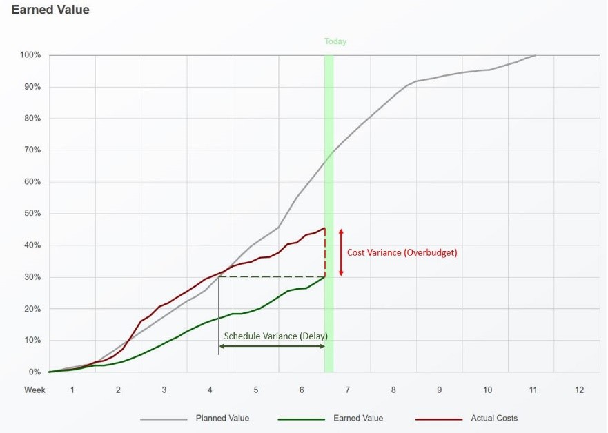
It seems that creating the graph like the one shown above is EASY. ^_^ Nope, it is not easy at all, but if it is not difficult if Planners understand the statistics and a smart way to work with compiling data.
This article presents 2 different ways to generate the EVM graphs.
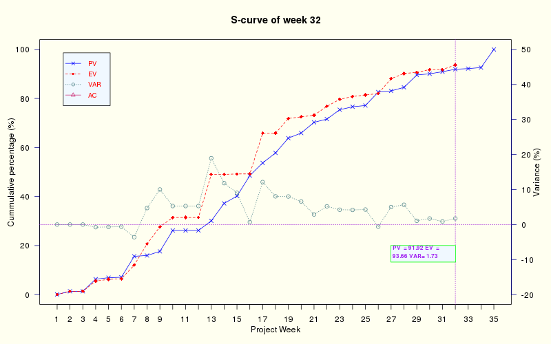
EVM for Consultancy Project using MS Project and R
#Coded by Nam Le (namlt@prontonmail.ch)

library(scales)
library(reshape2)
library(ggplot2)

#----------DATA-----------------

data <- read.csv(file="Scurve.csv", header=TRUE, sep=",")
k=data.frame(data)

# -----------------------------This needs to be modified whenever you plot


plot.new()
par(mar=c(4, 4, 4, 4), bg="ivory")
week= length(data[!is.na(data[,3]),3]) #the lastest week that EV value is available. Or you can simply put the number of week in instead of using length(data[!is.na(data[,3]),3]). Here 3 is the column.

scalefactor=100
trucy=100
ticktime=35   #Set the Project Week at which you want to limit the X-axis

varrange=c(-30,30)

#Posion of texbox (PV, EV, and VAR in the graph)

htextbox=c(week-5,week)
vtextbox=20
 # --------------------------------

 # ----------------------------

#Plot the baseline


plot(data$BS01[1:ticktime],pch=4,axes=FALSE,ylim=c(0,trucy),ylab="", xlab="",col="blue",type="o",lwd=1,lty=1, main =paste("S-curve of week", week))
axis(2, ylim=c(0,trucy),col="darkblue",las=1)
mtext(expression(paste("Cummulative percentage (%)")),side=2,line=2.2, adj = 0.5 )
axis(1,pretty(range(data$Week),30))
mtext(expression(paste("Project Week")),side=1,col="black",line=2.2)
box()

#plot the EV curve

par(new=TRUE)
plot(data$EV[1:ticktime],pch=18,axes=FALSE,ylim=c(0,trucy),ylab="", xlab="",col="red",type="o",lwd=1,lty=2)

#adding stick at the actual week

abline(v=week, col="darkviolet",lty=3)

par(new=TRUE)
#library(gplots)

library(astro) #this package is for astronomy but it has some fantastic function for plotting. Here I use the textbox function

textbox(htextbox, vtextbox, textlist=c(paste("PV  =",format(round(data$BS01[week],2)),"EV  =",format(round(data$EV[week],2)),"VAR=",format(round(data$EV[week]-data$BS01[week],2)))), justify='f', cex=0.7,col="purple", font=2, border="green", margin=-0.025,adj=0,box=1,fill="aliceblue")
#alternatively, we can also use legend function for the same purpose, but I believe textbox function gives better look.


#legend(30, 50, c(paste("PV:"),format(round(data$BS01[week],2)),paste("EV:"),format(round(data$EV[week],2)), paste("VAR:"),format(round(data$BS01[week]-data$EV[week],2))), col=c("blue","red","green"),cex = 0.6)


 #plot the VAR curve using

par(new=TRUE)
plot((data$EV[1:ticktime]-data$BS01[1:ticktime]),pch=1,axes=FALSE,ylim=varrange,ylab="", xlab="",col="cadetblue4",type="o",lwd=1,lty=3)
axis(4, ylim=varrange,col="darkblue",las=1)
mtext(expression(paste("Variance (%)")),side=4,line=2.2, adj = 0.5  )
abline(h=0, col="darkviolet",lty=3)

 #plot the AC curve: This curve is added only for internal monitoring purpose. Shall not give this to the other stakeholders.

par(new=TRUE)
plot(data$AC[1:ticktime],pch=2,axes=FALSE,ylim=c(0,trucy),ylab="", xlab="",col="violetred3",type="o",lwd=1,lty=1)
#axis(4, ylim=varrange,col="darkblue",las=1)

#mtext(expression(paste("Variance (%)")),side=4,line=2.2, adj = 0.5  )

#abline(h=0, col="darkviolet",lty=3)


#adding Planned Value, Earned Value, and Variance

#adding legend

legend("topleft", c("PV","EV", "VAR", "AC"), text.col
="red", border = "white",box.lwd = 1,bg="aliceblue",lwd = 1,pch=c(4,18,1,2),lty =c(1,2,3,1),  col=c("blue","red","cadetblue4","violetred3"),inset = .05,cex=0.8)

#save png file

dev.copy(png,'evm.png',width = 800, height = 500)
dev.off()
#-----THE END------------
Nam Le
Risk and Asset Management Specialist for Buildings and Engineering Systems
My research interests include Operation Research and Applied Statistics for Asset Management of Buildings and Engineering Systems.